
Seeking Feedback On Better Visualizing Benchmark Results

With the ten year anniversary of the Phoronix.com coming up on 5 June and the six year anniversary of the Phoronix Test Suite 1.0 release I am working on putting out the 5.2-Khanino release plus a lot of interesting benchmarks. As a result, for better visualizing the vast amount of data, I'm working on some Phoronix Test Suite graph rendering enhancements.
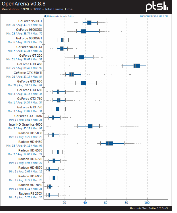
The most prominent change with the upcoming 5.2 release and will impact the upcoming 50-way results is the graphs when rendering the frame latency/timing... Now there's box plots turned on.
Some preliminary data from the upcoming comparison...
Now when viewing results from a number of test runs when it comes to comparisons, it's rendered to a box plot. Thus expressed is the minimum frame time, maximum frame time, first and third quartile frame time, and the median frame time quite easily... With the text descriptors is also the minimum, average, and maximum frame times for each run. Up to now when rendering results from many test runs it would just condense down into a bar chart with the average result.
With both the old and new code, when having a minimal number of runs, it will render the frame timings out to a line graph for best representation, e.g:
If anyone has any feedback for better representing the data, making it more useful, etc, it's much appreciated. Or for anyone that has any other visual feedback or other features for the traditional result graphs, that too is appreciated:
Simple feedback, new mock-ups, or code patches are welcome for everyone's benefit. The code is on GitHub for anyone wishing to optimize the pts_Graph display code.
Aside from these result display improvements, Phoronix Test Suite 5.2 when released next week also has built-in Phoromatic Server capabilities, improved line graphs, various other enhancements, and a few bug-fixes.
Update: Some improvements.
21 Comments